Consumer
PicMe
An AI-powered event platform that automatically delivers personal photo galleries to every guest.
Role
Year

The Challenge
A complex product, made to feel simple.
PicMe had to serve two very different mindsets at once. Guests arrive through a link with one goal: find my photos, but organizers arrive with a task: set up the event and manage everything around it. The product needed to feel light on the guest side, capable on the organizer side, and consistent enough to belong to one system.


Brand Direction
Warmth and technology, in balance
PicMe lives inside emotional moments: weddings, celebrations, conferences, and events people actually want to remember. But it also depends on serious technology working quietly in the background. The identity needed to feel warm and event-driven without becoming decorative, and clear enough for a product powered by AI. The final direction uses soft neutrals, an achromatic base, and one warm coral accent.
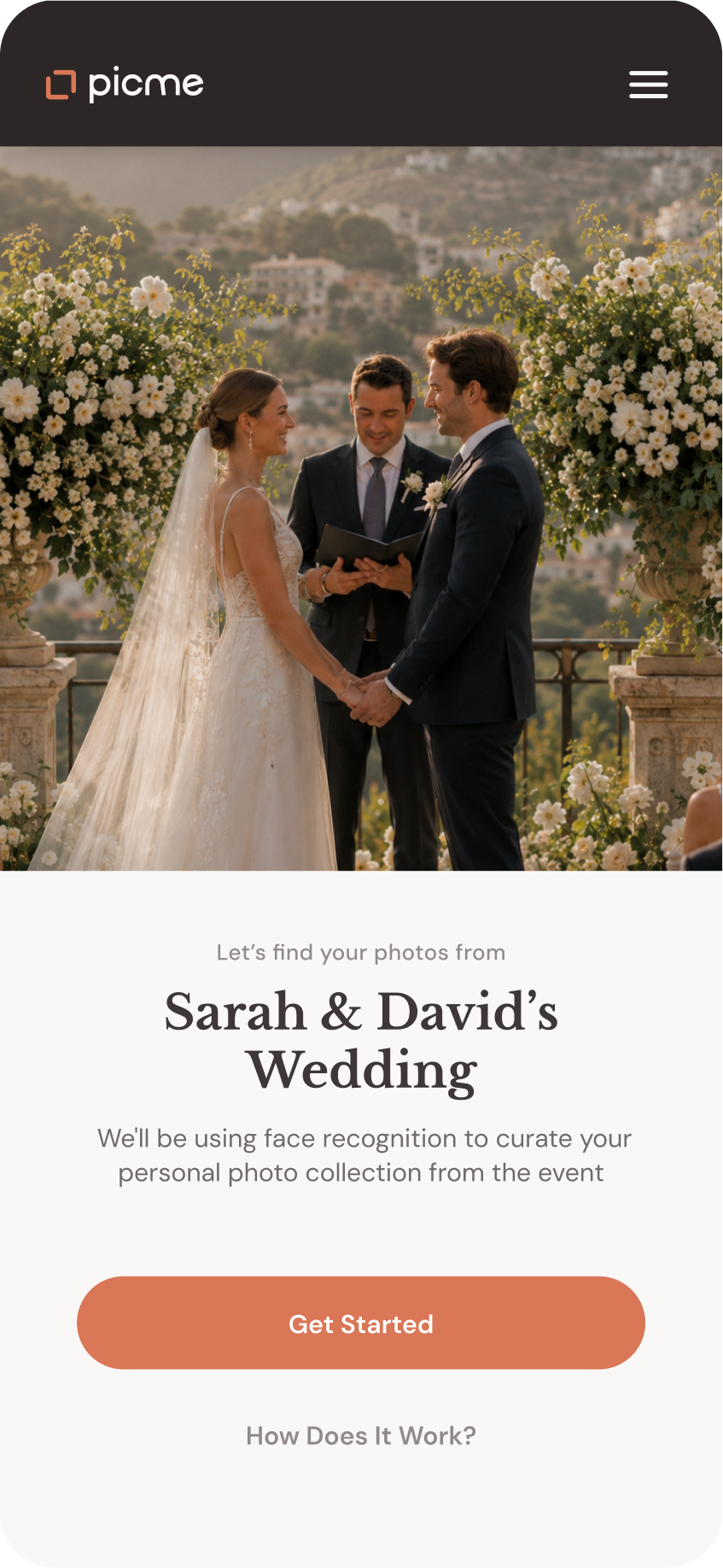
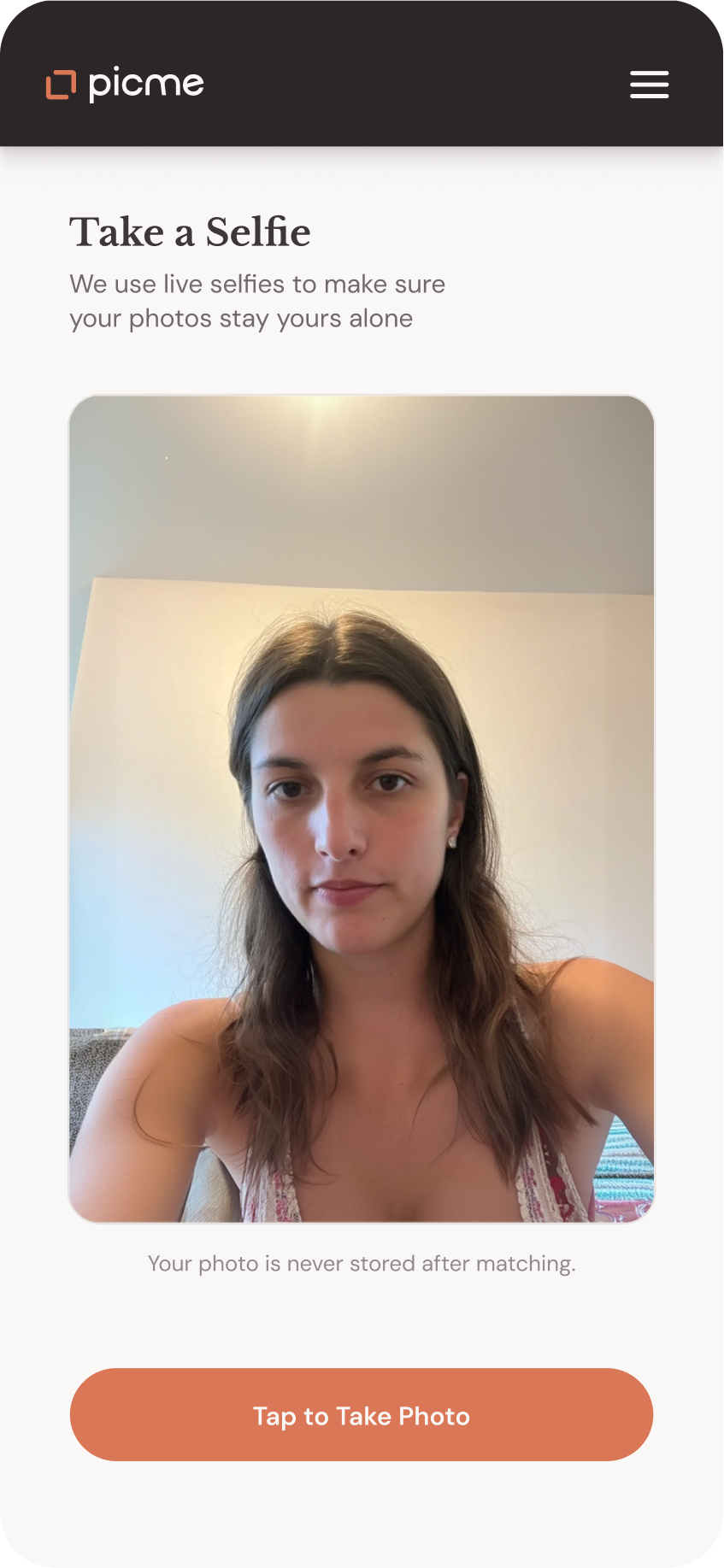
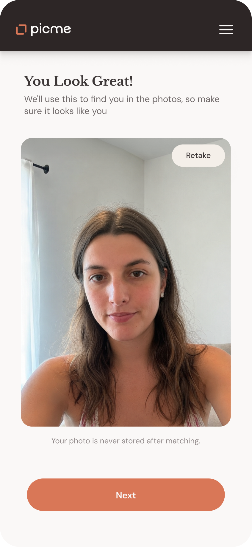
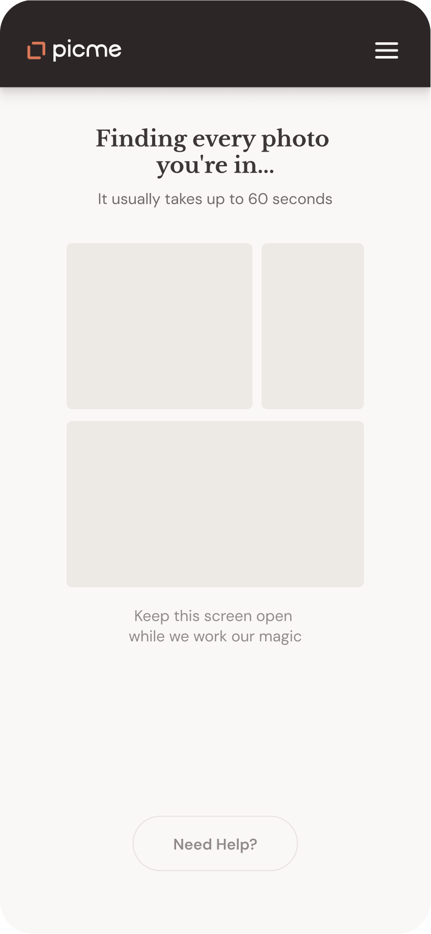
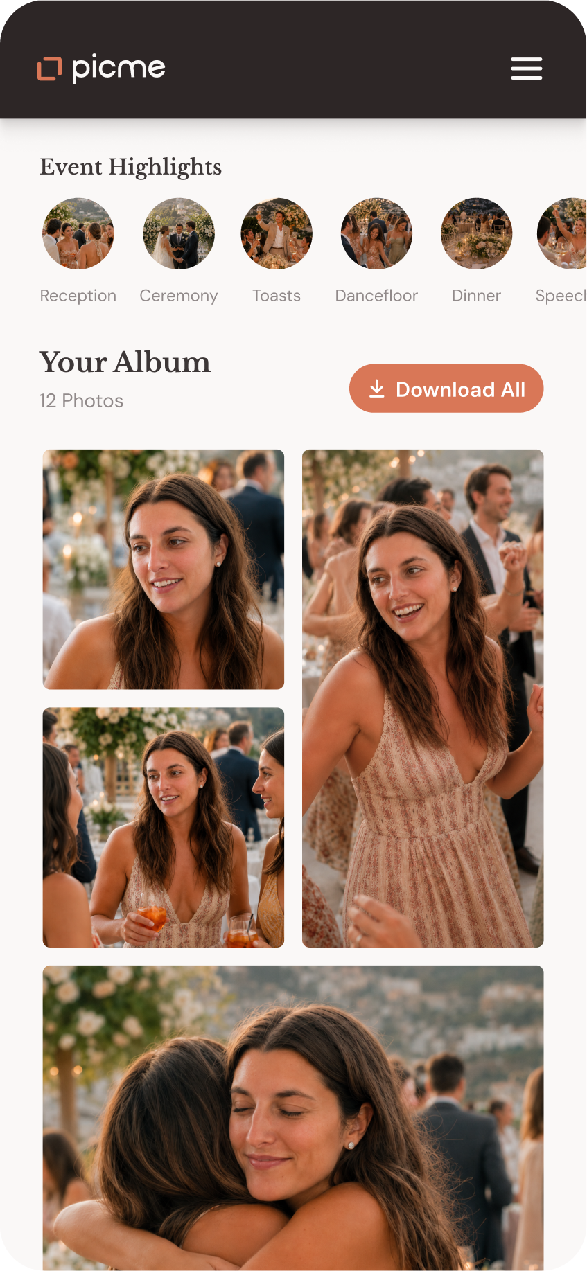
The guest flow
The guest flow needed to be the lightest part of the product. The flow was reduced to a few clear steps: open the link, take a selfie, confirm it, wait while the system finds the matches, and receive a personal gallery. Because facial recognition sits inside the flow, the experience had to be clear and reassuring. But the goal was not to over-explain the technology. It was to make the next step feel obvious.
Get the link
Take a selfie
Confirm
Loading...
Get your gallery
Organizer Dashboard
A 40+ screen workspace for managing events
The organizer side had to hold setup, uploads, delivery, and follow-up without flattening everything into one endless control panel. The structure was shaped around the organizer's timeline: what they need before the event, and what matters once the event is live and photos start moving through the system.
Before the event
Setup comes first: creating the event, uploading photos, and getting the system ready.


Selected screens from a larger 40+ screen dashboard.
During and after the event
Once the event is in motion, the dashboard shifts into status and visibility. The later phase focuses on management - photos, collaborators, and analytics.


Marketing site
The marketing site had to clarify who PicMe is for right away. It leads with the organizer's perspective, keeps the product promise concrete, and gives guests a separate, cleaner path into the experience.


The outcome
PicMe was designed in about a month, in focused sprints. The result is a working product foundation: clear flows, a shared visual language, and enough structure to keep building without pretending every detail was final.
Next Project
ReCar